Screen printing is a versatile and popular method for creating apparel designs. Whether you’re designing t-shirts, hoodies, or other apparel, the key to making your creations stand out lies in the art you choose. In this blog post, we’ll explore how to create impressive screen printing artwork using only a couple of colors while ensuring your message and design look exceptionally well done. We’ll also showcase examples of different imprint styles that will help your apparel stand out in a crowded marketplace.
The Art of Minimalism:
- Choosing a Limited Color Palette:
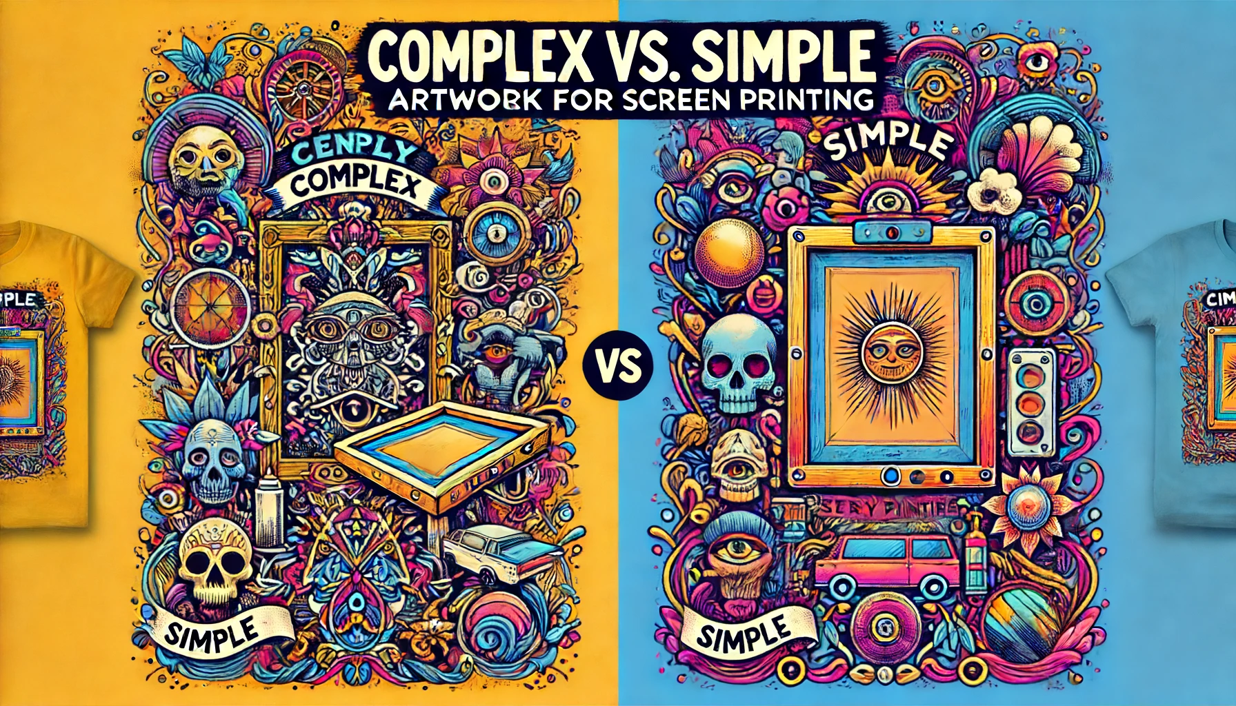
One of the fundamental principles of screen printing is working with a limited color palette. While this may seem restrictive, it can actually lead to incredibly striking designs. Start by selecting one or two primary colors that align with your message or brand identity. Limiting your color choices will force you to get creative with your design and focus on the essentials.
Example: Consider a black and white design for a sleek and modern look, or use contrasting colors to create visual impact.
- Embrace Negative Space:
Negative space is the area around and between the main elements of your design. Utilizing negative space effectively can create a clean, sophisticated look. Leave areas of your design blank or incorporate minimalistic patterns to make the most of the available colors.
Example: A simple outline of an object with ample negative space can be visually striking.
- Experiment with Halftones:
Halftone patterns involve using tiny dots to create shades of color and texture. This technique allows you to achieve gradients and shading effects with limited colors. Halftones can give your design depth and dimension.
Example: Try halftone patterns to create a vintage or retro feel in your artwork.
Design Techniques for Impact:
- Typography Matters:
Selecting the right font is crucial when conveying a message through screen printing. Bold and legible fonts work well for important text elements, while script or decorative fonts can add character to your design.
Example: Experiment with fonts to match the tone of your message, whether it’s playful, elegant, or bold.
- Vector Artwork:
When designing for screen printing, vector graphics are your best friend. Vector images can be resized without losing quality, ensuring your design looks sharp and professional on various apparel sizes.
Example: Incorporate vector illustrations or logos for crisp, clean lines in your artwork.
- Simplify Complex Ideas:
Sometimes, less is more. If your message is complex, find ways to simplify it into a visually compelling image. Focus on the core concept and eliminate unnecessary details.
Example: If you’re promoting environmental awareness, a minimalist tree silhouette with a recycling symbol can convey the message effectively.
Imprint Styles to Make Your Apparel Stand Out:
- Vintage Distressed Look:
Distressed screen printing gives your design a worn, retro appearance. It’s perfect for creating a vintage feel.
Example: Use distressed textures for a weathered, time-tested look.
- Bold and Eye-catching:
Bold and colorful designs can be achieved with minimal colors. Use large shapes and strong contrasts to grab attention.
Example: A red heart on a black background can make a powerful statement.
- Minimalistic Patterns:
Incorporate simple patterns into your design to add depth and visual interest.
Example: Tiny stars or polka dots can enhance the overall look of your artwork.
Creating excellent artwork for screen printing with only a couple of colors is all about creativity, simplification, and clever use of design techniques. By carefully selecting your color palette, embracing negative space, and experimenting with various design elements, you can produce striking and memorable apparel designs that will stand out in any crowd. Remember that less can be more, and minimalist screen printing can be incredibly effective in delivering your message while leaving a lasting impression and save money. Lets get started on a design today.